 |
 |
 |
||||
 3D 3D Photo Gallery (Part 1) 3D Photo Gallery (Part 2) Audio Poor Man's MIDI Make A Metronome iPod Tricks (Part 1) iPod Tricks (Part 2) iPod Tricks (Part 3) Laugh Track Machine Audio Player with Reverb Shepard Melody RB Phone Home Build a Drum Machine Custom Controls and Windows Double Click Listbox Draggable Metal Window Double Click Canvas Custom Buttons Custom Buttons Part II iTunes-style Listboxes Custom Controls General RB Scrolling Windows Using Mesage Dialogs Case-Sensitive Word Finder Introduction to Stacks Wiggle Window JPEG in PDF Listbox Checkboxes Background Applications Listbox Auto-Find Virtual Volumes Time Tracker Software Distribution (Part 1) Software Distribution (Part 2) Software Distribution (Part 3) Software Distribution (Part 4) Exceptions Tips and Tricks Text Clippings Made Easy Graphics Drawing a Simple Gradient The SpriteSurface: Space Game Image Spinner Cropping Graphics (Part 1) Cropping Graphics (Part 2) Cropping Graphics (Part 3) Cropping Graphics (Part 4) Shimmer Graphics Lissajous Figures Simple Screen Capture Vector Graphics Kaleidoscope Images Stegonography Spirals! Image Table RB Magnifying Lens Screen Capture Color Picker Tutorial Hacks Ghost Grab Speedy Mouse Extension iTunes Plugins iTunes Skinner Mac OS X Global Hot Key Event (Carbon Events) Login Welcomer (Carbon Events) Add/Remove Buttons Resizable Sheets Mac OS X Preferences Window Using Sheets in REALbasic Build a Bundle (Part 1) Build a Bundle (Part 2) Dock Your Passwords Mac OS X Debugging REALbasic Mac OS X Icon Tutorial Animate Your Dock RB and the Command Line Menus Window Menu Templates Menu Listbox Menu Novelty Guessing Game Calendar Trivia Tile Mixer Zip Code Finder Happy Valentine's Day Merlin Simulator (Part 1) Merlin Simulator (Part 2) Merlin Simulator (Part 3) Buzzword Machine AppleSoft BASIC Printing Print to PDF Registration Registration Code Validation Network Registration Codes Resources Picture Extractor (Part 1) Picture Extractor (Part 2) Serial Caller ID (Part 1) Caller ID (Part 2) Caller ID (Part 3) Speech Speech Recognition Socket Communication Easy Peer-to-Peer File Sharing MacPAD Version Checking Display Web Image In Canvas HTML IMG Tags Version Tracking Even Smarter Instant Messaging Web Tiler JavaScript and REALbasic Stock Ticker (Part I) Stock Ticker (Part 2) AIM Mate XML Manipulation Simple XML Introduction Video Big Brother Video Capture Note: All articles without a byline were written by Erick Tejkowski. When cleaning the site I removed them because the code differed from page to page, and I have yet to put them back in.
Tell us about a bad link. |
 |
Most modern operating systems today include a full set of standard interface controls. In fact, one of the greatest features of REALbasic is that you can use any of these interface elements by simply dragging them from the Toolbar onto a window to create an interface. Sometimes, however, you might need a control that simply doesn't exist in the operating system. The folks at REALSoftware expected this, so they gave you an elegant way to create custom controls using a subclass of the Canvas control. Preparing the Control To begin building a custom control, launch REALbasic or select File->New if you already have REALbasic running. Next, select File->New Class to create... you guessed it... a new class. Change the Name and Super properties of the new class to AppearanceSwitch and Canvas respectively. 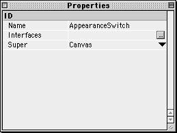
This class is much like a "recipe" for a fancy new control. Of course, we haven't added any instructions to the recipe yet (that's coming next). We named it AppearanceSwitch, because it will function as a simple on/off switch. We will also make it somewhat Appearance Manager savvy by using a color from the Appearance Control Panel. Adding Code to the Control Double click the AppearanceSwitch class in the Project Window to open its Code Editor. This is where we will add code (i.e. recipe instructions) explaining how to draw the control and how it acts. This is also the point where you will start to realize how much hard work went into the Mac OS interface and its various elements. Select Edit->New Property and create a Boolean property named selected. This property will keep track of the on/off state of the control. 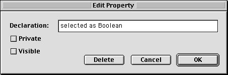
Next, open the MouseDown event of the class and add the following code: if y< (me.height/2) the//user clicked on the "OFF" part of the switch selected = FALSE else //user clicked on the "ON" part of the switch selected = TRUE end if //redraw the control me.refresh This code changes the selected property to FALSE if the user clicks in the upper half of the control and TRUE if the click is in the lower half. Once the user has clicked, we redraw the control with me.refresh in case the state of the switch has changed. Navigate to the Paint event of the class and enter the following code: //fill in all whiteg.ForeColor = RGB(255,255,255) g.fillRect 0,0,me.width,me.height g.textSize = 10 g.textfont = "Geneva" //fill in the side of the switch that is selected if selected = FALSE then//"off" is selected g.ForeColor = HighlightColor Color g.fillRect 0, 0, me.width, (me.height)/2 //draw the "off" text g.textSize = 10 g.textfont = "Geneva" g.ForeColor = RGB(0,0,0) g.DrawString "OFF", 4, 15 //draw the "on" text g.ForeColor = RGB(0,0,0) g.DrawString "ON", 6, 40 else g.ForeColor = HighlightColor//"on" is selected g.fillRect 0, (me.height)/2, me.width, me.height g.ForeColor = RGB(255,255,255) //draw the "off" text g.ForeColor = RGB(0,0,0) g.DrawString "OFF", 4, 15 //draw the "on" text g.ForeColor = RGB(0,0,0) g.DrawString "ON", 6, 40 end if //draw outline lines g.ForeColor = RGB(0,0,0) g.drawrect 0,0, me.width-1, me.height-1 g.drawrect 0,0, me.width-1, (me.height-1)/2 This code takes care of drawing the control. First, it fills the whole control in white. Then, it fills in the top half of the switch with color if the switch is in the "off" position (i.e. selected=FALSE). If the switch is "on" it fills in the bottom half of the switch with color. The color used for the fill is HighlightColor, which is selected by the user in the Appearance Control Panel. Finally, the code draws the appropriate text and frames the control with a thin black line. The final code you need to enter belongs in the Open event of the class. selected=FALSEme.width=25 me.height=50 This sets the switch to "off" and resizes the control to 25x50. Using the Control Now that you have finished building the control, you no doubt want to use it. To use the control, open Window1 from the Project Window. Drag the AppearanceSwitch from the Project Window into your Window1 interface, just as you would add a control from the Toolbar. Another great feature of using classes as controls is that they are instantly reusable. Simply drag the class from the Project Window into the Finder. Open a new or existing project and drag the class from the Finder into the Project Window. You are now free to use the class in any window of the project. Conclusion Your finished project should look something like this: (although the color may differ) 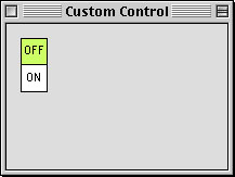
As usual you can download the completed project. |

|
|||
|
Please support ResExcellence by Visiting our Sponsors. One click makes a difference. |
||||||
 |
 |
 |





 |